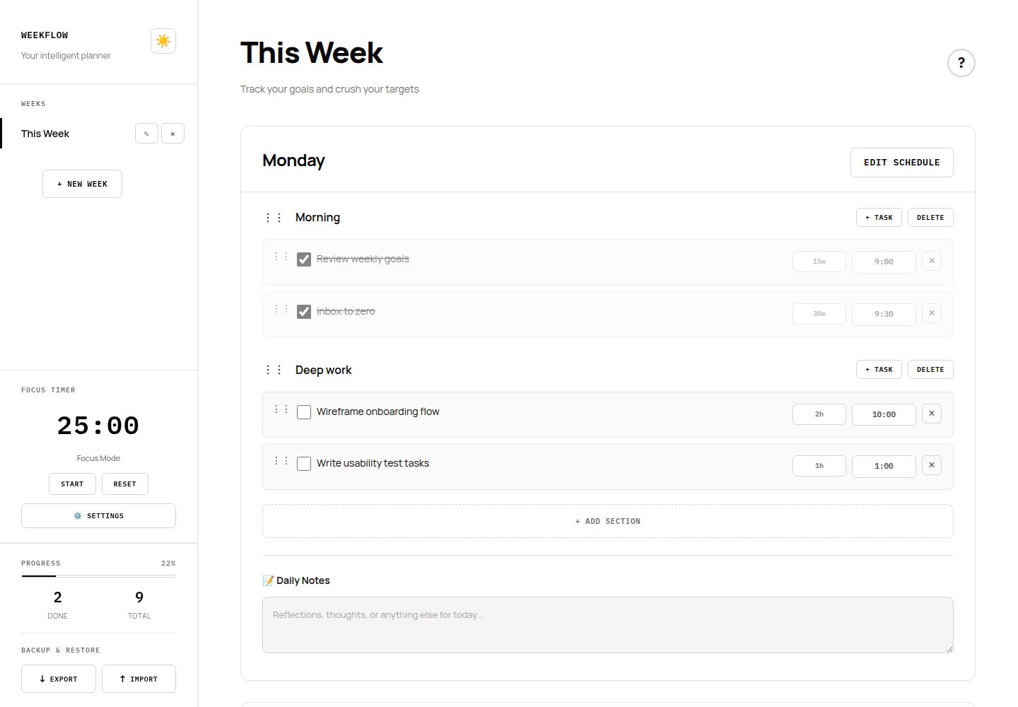
Problem
Most planning tools ask for an account before you've written a single task, then bill you monthly for the privilege. I wanted the opposite: open the page, start planning, and never think about a login screen.
Process
I started from the week grid itself, since that's the one view a planner can't get wrong. From there I layered in sections, inline editing, and a Pomodoro timer, testing each addition against the same question: does this still feel calm, or does it start to feel like a dashboard?
Key decisions
- Monochrome palette to cut visual noise so the content, not the chrome, holds attention.
- IBM Plex Mono for structural elements paired with Manrope for reading text, so the interface feels precise without feeling cold.
- All data stored locally in the browser. The tradeoff is no cross-device sync, made deliberately in exchange for privacy and zero setup friction.
Outcome
Shipped and in active use today. Since launch I've added drag-and-drop reordering, a dark mode toggle, and JSON/CSV export based on my own week-to-week use of it.
What I'd revisit
The monochrome constraint keeps the interface quiet, but it also means status at a glance (done vs. overdue vs. in progress) leans entirely on position and strikethrough rather than color. A future pass would test a narrow, deliberate use of color for state, without breaking the calm the palette was built for.