Brief
I set this brief to close a gap in my own portfolio: everything else I'd built was a single-purpose site. I wanted to design a full loop instead, discover, save, organize, to show I can think about information architecture and flow, not just one polished screen.
Process
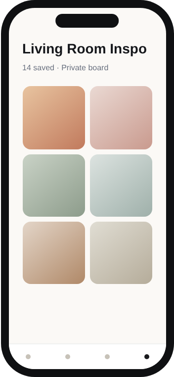
I mapped the core loop first: browse a feed, save something in one tap, find it again later in an organized board. Every screen after that was built to protect that loop rather than add features on top of it.
Key decisions
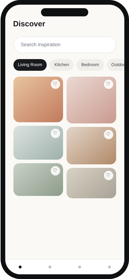
- A masonry grid on the discovery feed, since inspiration content is naturally different aspect ratios, and forcing it into uniform tiles would flatten exactly what makes it feel curated.
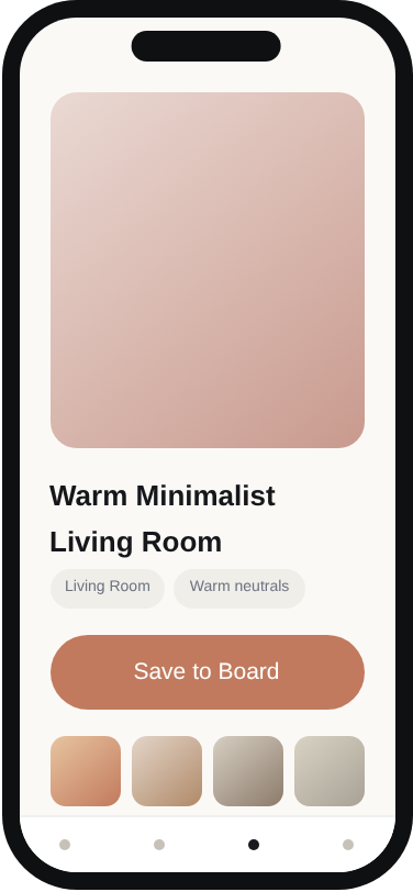
- Save-to-board as a single tap on the feed itself rather than a separate page, since adding friction to the core action of the whole app was the one thing I didn't want to trade away for polish.
- A serif display face paired with a warm, muted color system to make the app feel like an edited collection, not a utility, deliberately different from Weekflow's quieter, more functional register.
Outcome
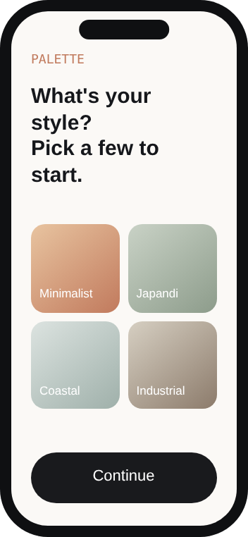
Four core screens designed end to end: onboarding, discovery feed, item detail, and board view, as a coherent system sharing one navigation pattern and one visual language.
Honest note
This is a concept exploration, not a built or coded product, and the imagery is a curated color system standing in for photography rather than real photos. I designed it this way deliberately, to keep the focus on layout, hierarchy, and flow rather than sourcing.