product & UI design

I design the small decisions that make software feel considered.

Computer science background, self-taught design practice. I've shipped two products end to end, from the first layout decision to a live URL, and I write down why I made each choice along the way.

Charlotte, NC Figma · Adobe XD · Illustrator HTML / CSS / Sass fluency Open to product design roles
~/case-studies/weekflow

Weekflow — a weekly planner with nothing to sell you

A browser-based planner built on a simple constraint: no accounts, no cloud sync, no subscription. Just open it and plan.

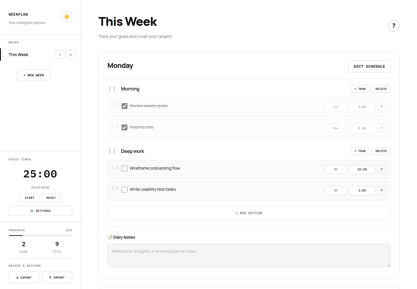
Weekflow weekly planner interface showing task sections, time estimates, and the Pomodoro timer sidebar

Problem

Most planning tools ask for an account before you've written a single task, then bill you monthly for the privilege. I wanted the opposite: open the page, start planning, and never think about a login screen.

Process

I started from the week grid itself, since that's the one view a planner can't get wrong. From there I layered in sections, inline editing, and a Pomodoro timer, testing each addition against the same question: does this still feel calm, or does it start to feel like a dashboard?

Key decisions

  • Monochrome palette to cut visual noise so the content, not the chrome, holds attention.
  • IBM Plex Mono for structural elements paired with Manrope for reading text, so the interface feels precise without feeling cold.
  • All data stored locally in the browser. The tradeoff is no cross-device sync, made deliberately in exchange for privacy and zero setup friction.

Outcome

Shipped and in active use today. Since launch I've added drag-and-drop reordering, a dark mode toggle, and JSON/CSV export based on my own week-to-week use of it.

What I'd revisit

The monochrome constraint keeps the interface quiet, but it also means status at a glance (done vs. overdue vs. in progress) leans entirely on position and strikethrough rather than color. A future pass would test a narrow, deliberate use of color for state, without breaking the calm the palette was built for.

Vanilla JS CSS Grid + Flexbox localStorage Responsive
→ view live site
~/case-studies/ironclad-fc

Charlotte Ironclad FC — a broadcast-inspired sports marketing site

A concept marketing site for a fictional Charlotte soccer club, built to design a full sports funnel: awareness through the hero, to a ticket purchase CTA.

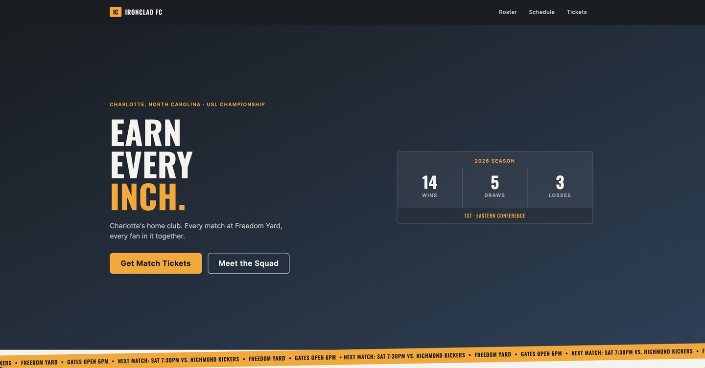
Charlotte Ironclad FC marketing site showing the hero section, ticker strip, and team content

Brief

I set this brief for myself deliberately: design a real-world marketing layout, not an isolated component demo. That meant a hero, roster, schedule, news cards, ticket CTA, and sponsor placements all working together as one identity.

Process

I built the identity around live sports broadcasts rather than generic sports-brand cliché: charcoal, steel blue, amber, and teal, paired with a condensed display face that reads the way a scoreboard reads.

Signature element

An auto-scrolling, skewed ticker strip styled after a broadcast lower-third. It's the one element I let carry all the personality, everything else on the page stays quiet so the ticker keeps its edge.

Craft details

  • Built the visual system in Sass (variables, nesting, mixins) so the palette and spacing scale stay consistent across every section.
  • Respected prefers-reduced-motion on the ticker animation rather than treating accessibility as an afterthought.
  • Fully responsive down to mobile, tested against the same grid Bootstrap 5 provides as scaffolding.

Honest note

Charlotte Ironclad FC is a concept, not a live client. I built it to prove I can design a complete, multi-section marketing site with a real identity, not just a single polished screen.

Sass / SCSS Bootstrap 5 Responsive Motion + a11y
→ view live site
~/case-studies/palette

Palette — a visual discovery app for home design inspiration

A self-directed concept project: a full mobile app flow for browsing, saving, and organizing home design inspiration, designed to prove I can think in systems and flows, not just individual screens.

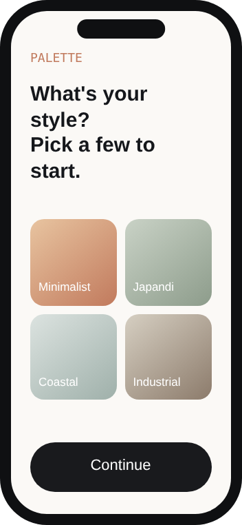
PALETTE
What's your style?
Pick a few to start.
Minimalist
Japandi
Coastal
Industrial
Continue
01 — Onboarding
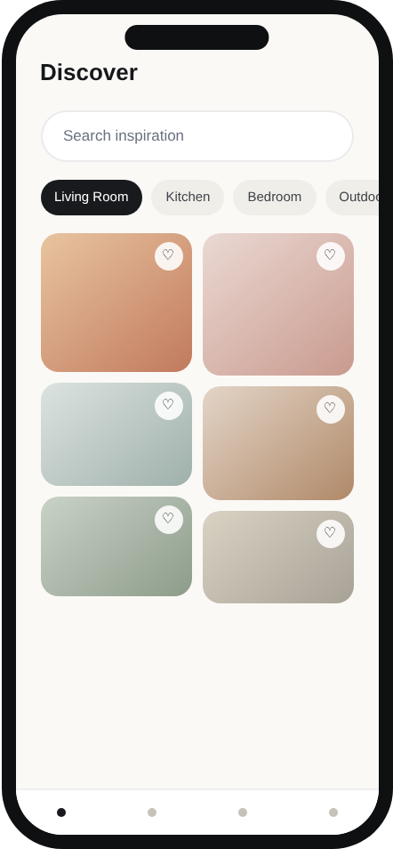
Discover
Living Room Kitchen Bedroom Outdoor
02 — Discovery feed
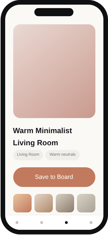
Warm Minimalist
Living Room
Living Room Warm neutrals
Save to Board
03 — Item detail
Living Room Inspo
14 saved · Private board
04 — Boards

Brief

I set this brief to close a gap in my own portfolio: everything else I'd built was a single-purpose site. I wanted to design a full loop instead, discover, save, organize, to show I can think about information architecture and flow, not just one polished screen.

Process

I mapped the core loop first: browse a feed, save something in one tap, find it again later in an organized board. Every screen after that was built to protect that loop rather than add features on top of it.

Key decisions

  • A masonry grid on the discovery feed, since inspiration content is naturally different aspect ratios, and forcing it into uniform tiles would flatten exactly what makes it feel curated.
  • Save-to-board as a single tap on the feed itself rather than a separate page, since adding friction to the core action of the whole app was the one thing I didn't want to trade away for polish.
  • A serif display face paired with a warm, muted color system to make the app feel like an edited collection, not a utility, deliberately different from Weekflow's quieter, more functional register.

Outcome

Four core screens designed end to end: onboarding, discovery feed, item detail, and board view, as a coherent system sharing one navigation pattern and one visual language.

Honest note

This is a concept exploration, not a built or coded product, and the imagery is a curated color system standing in for photography rather than real photos. I designed it this way deliberately, to keep the focus on layout, hierarchy, and flow rather than sourcing.

Mobile-first Information architecture Design system thinking Figma-style concept